The hidden trend within Netflix’s enormous “data dumps”


Hello! Welcome to Deviations, and thank you so much for signing up. Your support means the world.
I’m still dialing in the structure of Deviations, so please send me feedback and suggestions via this contact form. And if somebody forwarded you this newsletter and thought (correctly) that you’d like it, sign up to receive future editions.
Without further ado: Let’s get to it!
What I’ve been up to
Shipwreck! A few weeks ago, I wrote an exclusive story for the New York Times about the discovery of a fascinating World War II-era shipwreck off the coast of California. The ship, known as DD-224, was the only U.S. destroyer captured by Japanese forces during World War II. Here’s a gift link to the story.
Three Mile Island. You may have heard that Microsoft has agreed to purchase power from Three Mile Island, the nuclear plant that suffered a partial meltdown in 1979. The catch: The plant’s final reactor was decommissioned in 2019. Microsoft wants that reactor brought back online to provide steady, low-carbon power to the company’s data centers. But how exactly will the U.S. oversee the hypothetical restarting of this reactor and other previously decommissioned ones? I examined this question for Nature. Take a look.
Magic at the Library of Congress. The Library of Congress has about 24,000 items in its vast collections that are related to magic, a lifelong hobby of mine. These holdings include nearly 4,000 books from Harry Houdini’s library, as well as ingenious props used by Johann Hofzinser, a 19th-century Austrian magician who’s considered a founding father of modern close-up magic. I recently gave a talk about these collections and the history of the Library of Congress at an event organized by the magic supplier Vanishing, Inc.
Things you should check out
This story about a U.S. nuclear-bomb factory. Freelance journalist Sarah Scoles just won a richly deserved award for her coverage of nuclear weapons for Scientific American, the New York Times, and Science. Scoles’s stories are all excellent, but if you want to dive in, check out her SciAm feature about her surreal visit last year to Los Alamos National Laboratory, where the U.S. is making new “plutonium pits” for modernized nuclear weapons.
The definitive feature on Facebook’s AI slop. 404 Media cofounder Jason Koebler published a feature back in August that has haunted me ever since. If you’ve been on Facebook at all this year, you’ve probably noticed a flood of spammy, AI-generated images depicting everything from unrealistic sand sculptures to “Shrimp Jesus.” Jason tracked down who makes these sorts of images and why; without spoiling his reporting, it’s a grim, powerful read.
Bad Monkey. In this Apple TV+ adaptation of the Carl Hiaasen novel of the same name, Vince Vaughn plays a restaurant inspector (and former homicide detective) who’s trying to solve a murder mystery set in Florida and the Bahamas. It’s a lot of fun and has a stacked cast.
Smart takes on the presidential endorsement fiasco. Last week, the Los Angeles Times and Washington Post announced that they wouldn’t be making endorsements in the U.S. presidential election, to their subscribers’ shock and outrage. On Monday, NPR reported that the Post alone has seen more than 200,000 cancellations since last Friday. (Full disclosure: I occasionally freelance for the Post’s news division, which is run separately from the opinion division.)
Sewell Chan of the Columbia Journalism Review had great early coverage of the Post brouhaha. On Substack, union leader (and ex-Times journalist) Matt Pearce wrote a sharp essay on why these newspapers’ subscribers should think twice before canceling in protest. Post humor columnist Alexandra Petri ended up publishing her own endorsement of Kamala Harris. Other publications have also jumped into the fray. On Tuesday, The Verge’s Nilay Patel published a thought-provoking Harris endorsement that’s framed around clever tech analogies and the challenge of collective action problems.
The Deep Dive: The riddle of Netflix and KAOS
Occasionally, this newsletter will feature data-driven deep dives on offbeat subjects that may range beyond the sciences. Today, we’re going to be talking about Netflix — and a question about a show cancellation that has vexed me for weeks.
For those who don’t know, KAOS is a Netflix show where the Greek pantheon still rules in the modern day, and Zeus is a paranoid Jeff Goldblum in a track suit (a pretty good concept!). After premiering on Netflix on August 29, it garnered generally favorable reviews, pulling in a 76% on Rotten Tomatoes.
The trailer for KAOS.
KAOS appeared on my radar a few weeks ago when I saw some unfortunate news about it in the trades. Despite the showrunner’s grand plans for a three-season arc, Netflix canceled KAOS on October 8, a mere 40 days after its premiere.
At some point, Netflix brass must have weighed the cost of KAOS — rumored to be more than $50 million, according to sources in Spain, where it was filmed — against its viewership, a figure of ever-increasing importance as the streamer tries to expand its advertising business and monetize eyeballs more directly.
What struck me here was the timing. It took Netflix all of 40 days to make a sweeping decision on the fate of a high-investment show. How could the streamer come to this decision so swiftly?
Netflix’s hidden viewership curve
To answer this question, we need to address a more general one: How much does a Netflix show’s long-term viewership depend on its performance its first 40 days or so on the platform?
Thankfully, we have a lead. While listening to The Town, an entertainment industry podcast by Puck’s Matthew Belloni, I learned that every six months, Netflix releases cumulative viewership data for the platform’s many TV shows and movies. (Check out the “data dump” for the first half of this year.) Netflix also releases weekly lists of the platform’s top 10 shows and movies by viewership (more on what a “view” is below).
Here’s my idea. Thanks to Netflix’s Top 10 rankings, we have weekly snapshots for some Netflix shows’ viewership. We can then compare these weekly figures with the shows’ total viewership over a six-month period.
Imagine that Show X entered the Netflix Top 10 for several weeks, and we worked out that the show got 25% of its six-month viewership during its first week on the streamer. Then, during its second week, Show X got another 20% of its six-month viewership, for a two-week total of 45%. And so on.
If we ran these numbers for many different shows, we’d start to get a sense of how quickly a top-10 show on Netflix tends to accrue its longer-term viewership. So that’s what I did for 133 seasons of English-language TV shows that premiered on Netflix between July 1, 2023, and June 15, 2024. Here’s a summary chart:
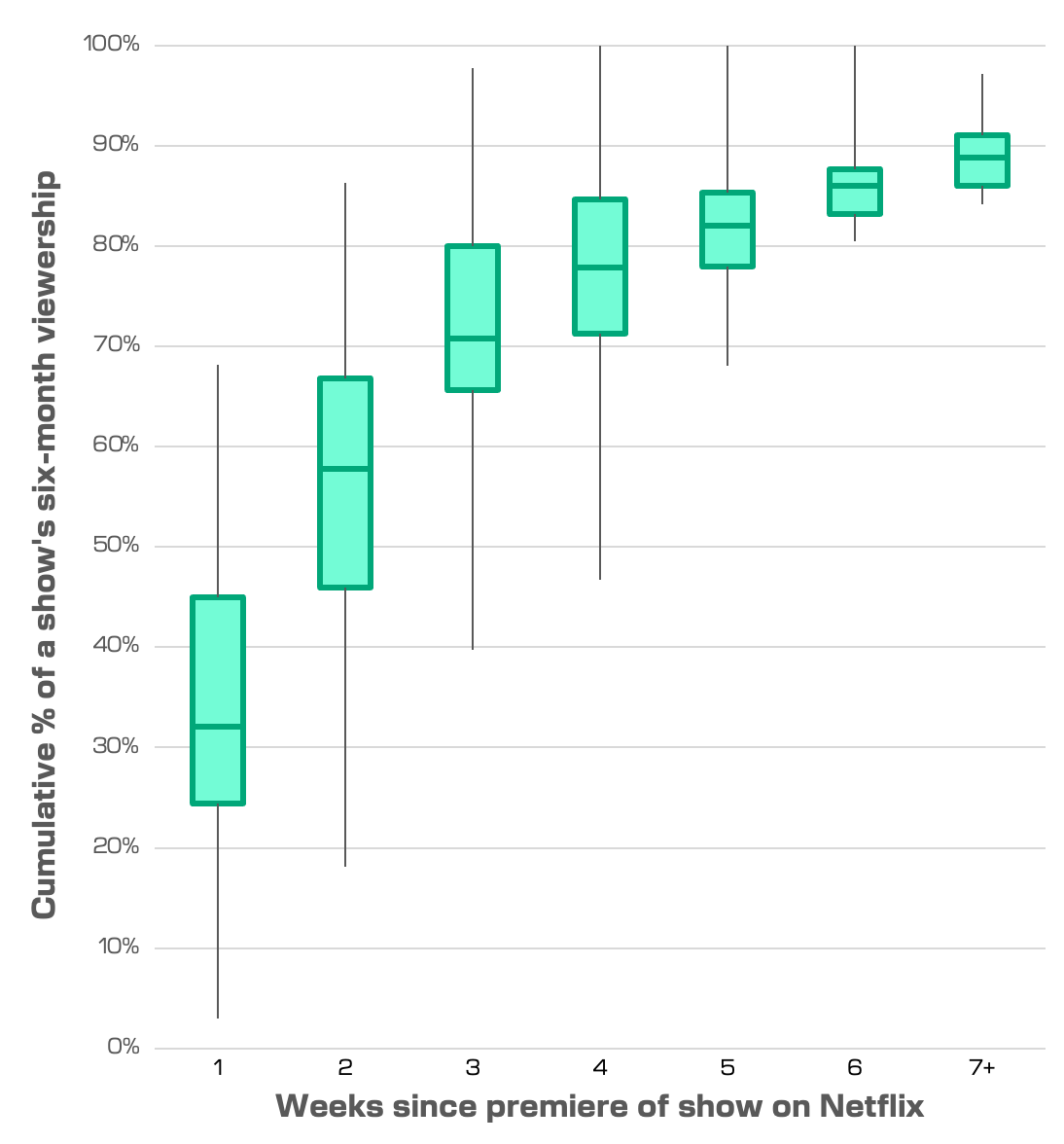
Think of this chart as a generalized guide to how Netflix shows build up their audiences. The upshot: To the extent that there’s a long tail, it’s narrow.
After cleaning the data, the vast majority of the top-10 Netflix shows I looked at had accrued at least a quarter of their six-month viewership within just their first week on the platform. By the end of the third week, three-quarters of the shows for which I had data had accrued more than 65% of their six-month viewership. After six weeks, all the shows for which I had data had accrued more than 80%.
I don’t want to claim that I’m the first person who has done this analysis in a public-facing way, but the closest comparison I’ve found so far is some weekly charts of individual streaming shows’ Nielsen ratings. To the extent there’s novelty here, I hope it’s useful or at least interesting.
How to lose a show in 40 days
Netflix’s data suggest that many of the streamer’s top-10 shows get much of, if not most of, their six-month viewership within the first seven weeks or so. In all likelihood, Netflix canceled KAOS after only 40 days because the show had garnered most of the viewership it was going to get, and executives felt confident that the show wouldn’t meet its subscription and advertising revenue goals.
On one level, this is obvious: Ideally, you don’t rush to cancel a big-budget project unless you’re confident in doing so. Even so, it’s satisfying to put numbers to the vicissitudes that Netflix shows can experience. Some creatives have said that to boost Netflix shows’ odds of renewal, shows must be watched in full upon release or risk an unceremonious cancellation after a single season. This particular axe falls so swiftly, and so often, that the HBO series Barry memorably parodied it:
“The algorithm felt it wasn’t hitting the right taste clusters.”
It’s gotten to the point where some Netflix subscribers claim that they refuse to start watching intriguing new shows at all, having resigned themselves to the shows’ future cancellation and unsatisfying lack of resolution. But in a self-fulfilling prophecy, if people aren’t tuning in, then cancellations become inevitable.
These dynamics stem in part from Netflix’s strategy of dropping all of a TV season’s episodes at once. Most other streamers dole out at least some of their shows piecemeal, to generate weekly water-cooler buzz and earned media. Look at what HBO Go HBO Now HBO Max Max is doing with The Penguin, for instance, or what Disney+ is doing with Agatha All Along. But with limited exceptions, Netflix doesn’t seem to like running that play.
Combine shows’ short viewership fuse with the Netflix library’s sheer size — more than 16,000 titles — and you have the media equivalent of the hangar at the end of Raiders of the Lost Ark: a vast trove where most things lie forgotten.
A new method for Netflix rankings?
On a September 23 episode of The Town, Belloni understandably complained that show rankings based on Netflix’s six-month data dumps are flawed. Within a given data dump, some shows have had more time to accrue viewers than others. Ideally, one would adjust for that discrepancy.
Now we can. Our analysis lets us create such an adjustment, albeit a coarse one, by letting us define a theoretically reasonable function that describes how quickly a show’s viewership builds up over time. With this function in hand, we can then make crude projections of shows’ longer-term viewership totals.
To show you what I mean, here’s the un-binned data for individual shows. I have added two functions atop this data: a best-fit logistic function (R2 = 0.67), and a best-fit first-degree rational function (R2 = 0.68):
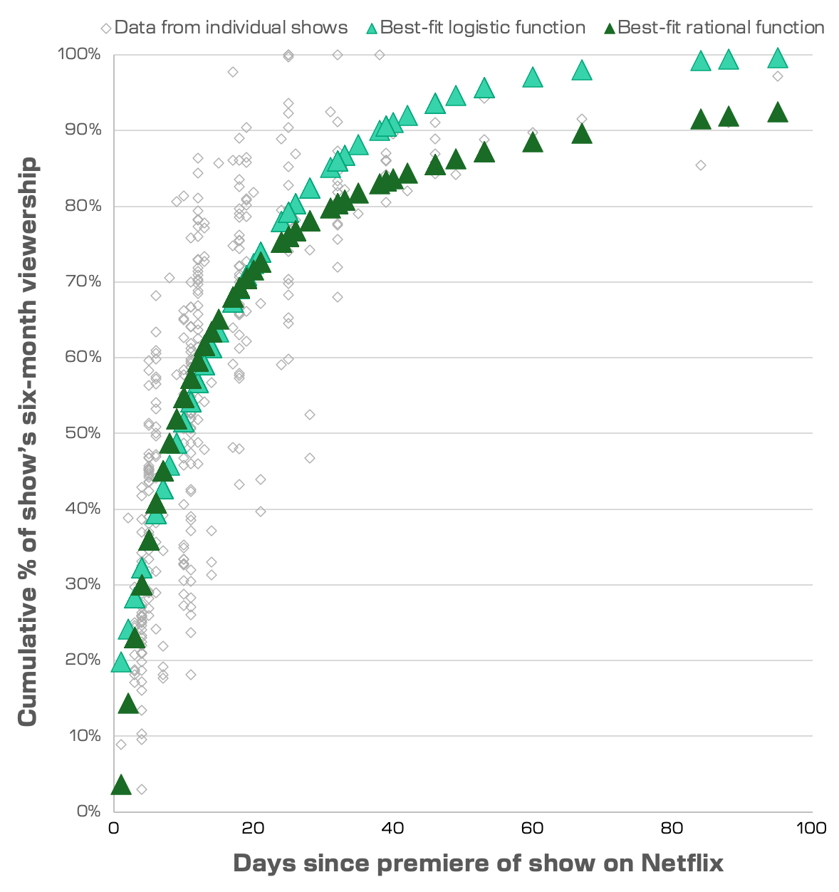
There’s obviously spread in the data, hence the use of “coarse” and “crude” above. (In a perfect world, I’d do a better job of handling the uncertainties at play here.) But even now, these functions — the two sets of green triangles in the chart — are at least consistent with the data, which I deem to be okay enough for this exercise.
As it turns out, not much happens if we apply a correction using one of these functions. For Netflix’s most recent data dump, which went from January 1 to June 30, the raw view counts for English-language TV shows correlate extremely well (Spearman’s rho = 0.996) with “corrections” made using the more show-friendly rational function. There’s practically no change in the shows’ rankings.
Large ranking shifts occur only for the handful of shows that premiered on Netflix in June, near the end of the covered time period. After applying my correction, the British superhero series Supacell, which premiered on June 27, goes from Netflix’s #253 show by views during the first half of this year to a far more respectable #35. As it happens, Supacell got renewed in August.
Wrap-up comments
This analysis is hardly the be-all-end-all. Some qualifiers, off the top of my head:
- No differentiation between one-episode specials (e.g., comedy specials), scripted shows, and unscripted shows. It’d be perfectly reasonable for these different types of shows to behave differently.
- Overly dependent on the biggest hits. As you may have noticed, there are very few data points for individual shows 30 days or more after their premieres. That’s because a show would have needed to remain in the Netflix Top 10 for that long for me to have a weekly snapshot from that point in time.
- No distinction between base hits and home runs. One could easily imagine that megahits and blink-and-you-miss-it entrants to the Netflix Top 10 behave differently. Maybe there’s some substructure that I’m stomping all over.
- No movies. Do movies behave differently from TV shows? Again, another question for another time.
And a big one for the underlying dataset: The data that Netflix releases are incomplete at best, starting with the streamer’s definition of a “view.”
According to Netflix, a “view” occurs when Netflix’s subscribers collectively watch a show for an amount of time equivalent to the show’s runtime. If a seven-hour-long season of a TV show accrues a watch time of 14 million hours, Netflix claims that the show garnered 2 million “views,” dividing 14 million hours by seven hours.
For this proportional analysis, where everything is in percentages, the metric ends up being fine to use; I got near-identical results when I tested using total watch time instead. But by itself, the “view” is an attentional hot dog, extruded from a ground-up paste of many people’s viewing habits. To hit 2 million views, a seven-hour-long TV season could be watched for 15 minutes by 56 million casual watchers — or it could be watched and re-watched in full by 7 million die-hard fans.
Ideally, Netflix would also report how many subscribers pressed play on a given series, as well as each show or movie’s completion rate. Bringing it back to individual humans’ behavior would help us see how people really use Netflix. Then again, that’s probably why Netflix isn’t releasing that information.
If you want to play with the data yourself, here’s the Excel file I used to make these charts, with all the raw data and a description of my data cleaning methodology.
To close, an anagram summary:
That’s it for the first edition of Deviations. Thanks for your time! Please send along any feedback you may have via this contact form, and consider succumbing to the temptation to click this big, beautiful button: